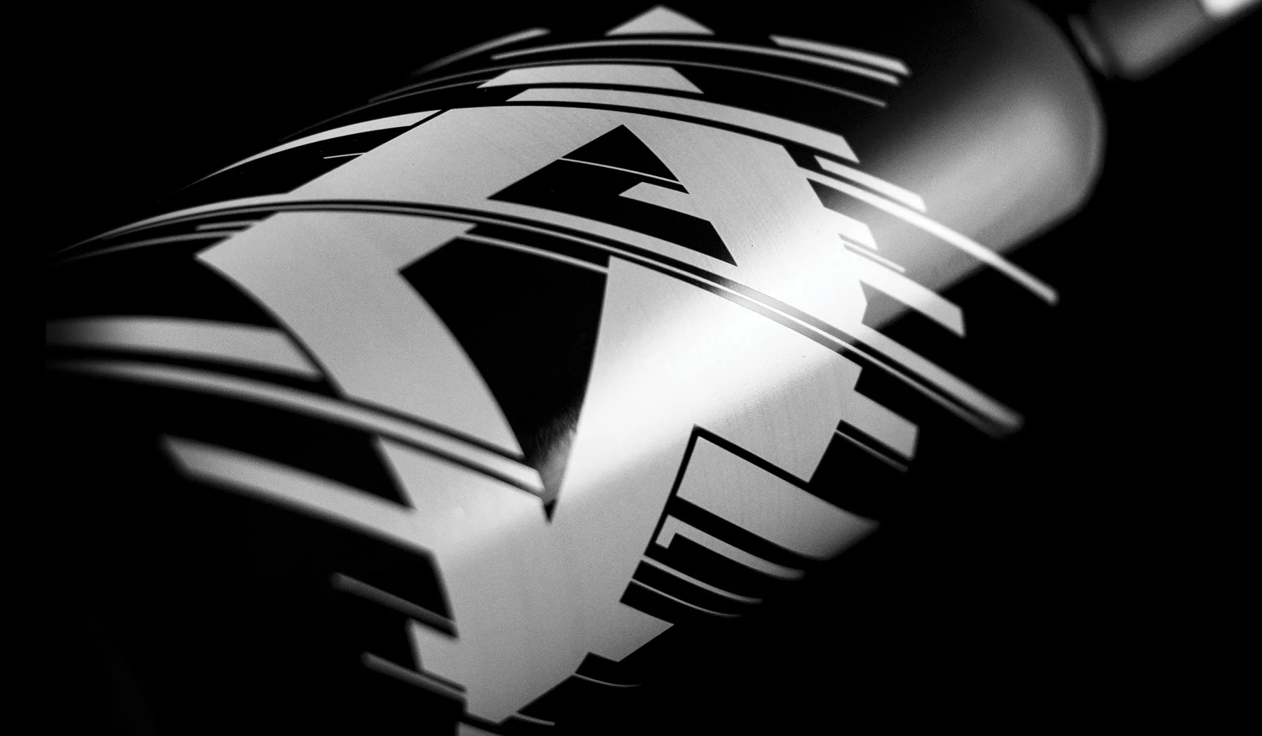
On the side titled ’10 Years of Art’, a bold and cohesive logo mark dominates the bottle. This mark is important as it is inspired by the brand’s award-winning identity from 2015, representing the agency’s strength in sum of their many parts.
On the reverse side of the bottle, that same logo mark is deconstructed using negative space to reveal the precision that is behind the aesthetic – fitting, as this side is titled ’10 Years of Science’. Within the precise grids, cut lines, and registration marks are small nods to the agency’s ten-year history, including past street addresses and fun jabs at agency clichés.
SERVICES: PACKAGING DESIGN, BRANDING
CREDITS: BRIGADE